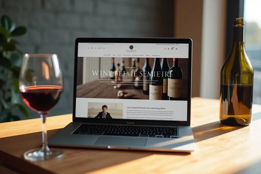
A wine website should do more than present beautiful bottles and vineyard photography. It should help a visitor answer practical questions quickly: What will this taste like? What should I serve it with? And is it right for tonight? Looking at strong examples of wine web design can inspire a polished visual direction, but the final site must be built around clarity rather than appearance alone. Wine shopping can feel intimidating online.
Visitors may not recognize a grape, understand a regional term, or know whether “structured” means they will enjoy the bottle. A useful website acts like a knowledgeable host. It gives enough guidance to build confidence without making newcomers feel as if they need a lesson before they can buy, book, or browse.
Start With The Visitor’s Main Questions
Organize pages around the questions customers actually bring to the site, not only internal winery categories. A product page should make the following details easy to find:
- Whether the wine is dry, sweet, crisp, smooth, light, or bold.
- Its grape variety, region, vintage, bottle size, alcohol content, price, and current availability.
- Food pairing ideas, serving temperature, and a simple occasion, such as gifting, dinner, or casual sipping.
- Shipping, pickup, delivery timing, and tasting-room booking information where relevant.
Put the most important answers near the top. Technical production notes can still appear later for enthusiasts, but they should not obscure the decision-making basics.
Design A Homepage With A Clear First Step
The homepage should tell visitors what they can do within a few seconds. Lead with a direct headline and one primary action, such as “Find Your Next Bottle” or “Plan Your Winery Visit.” Then offer a small group of useful pathways: Shop by Taste, Shop by Food, Find a Gift, or Book a Tasting. Avoid turning the first screen into a collection of competing buttons, autoplay videos, and promotional messages. A short supporting sentence can explain the winery’s point of view, but the visitor should always know what to do next.
Use Visuals That Support The Decision
Photography should provide useful context. Show bottles clearly, keep product images consistent, and include close-ups when label details matter. Vineyard, cellar, tasting-room, and serving images can create atmosphere, but they should support the product rather than replace its information.
Use captions or nearby copy when a photo communicates something important, such as a limited-release format or outdoor tasting setting. Compress image files, reserve animation for moments with a purpose, and ensure each image still works well on a slower mobile connection.
Write Product Descriptions That Sound Human
Start with familiar language. “Bright lemon, green apple, and a clean finish” is more helpful to most shoppers than a paragraph filled with specialist vocabulary. Follow the quick taste summary with optional details about body, acidity, oak, vineyard practices, or aging.
A Simple Description Formula
- First impression: Describe the wine in plain language.
- Flavor and texture: Explain fruit, spice, body, and finish.
- Best match: Suggest foods, occasions, or gift recipients.
- Practical details: Confirm vintage, price, bottle size, and availability.
Give Visitors Simple Ways To Compare Options
Useful filters reduce uncertainty. Let people browse by color, sweetness, body, price, region, occasion, and food pairing. Include sorting options for staff favorites, newest releases, popularity, and price. Make every filter easy to remove, especially on a phone. Visual guides can help beginners interpret a lineup faster. Research on visual sweetness scales for novice wine consumers suggests that simple cues may increase purchase interest, though they can also influence perceived quality. Use guides as helpful context, not as a substitute for thoughtful descriptions.
Build Trust Through Honest Information
Trust is created in the details. Display prices before checkout, identify limited-availability or sold-out products, and clearly explain shipping fees, delivery areas, refund policies, cancellations, and age-verification requirements. Include real contact details and useful customer reviews instead of generic praise. Keep vintage information, event dates, inventory, and tasting-room hours current. A visitor who finds an unavailable bottle or outdated event listing may question the accuracy of everything else on the site.
Make Navigation, Mobile Use, And Accessibility Feel Natural
Keep the main menu short and familiar, separate shopping, visits, learning, and support. Add search in a predictable location, and use breadcrumbs on deep product, collection, and educational pages so visitors understand where they are. Build for phones from the beginning. Use large tap targets, readable text, simple forms, and checkout steps that are comfortable to use with one hand. Important information should appear before long image blocks, and intrusive pop-ups should be rare.
Accessibility is part of good customer service. Maintain strong contrast; do not rely on color alone to indicate sweetness or availability; add meaningful alternative text; and make controls usable with a keyboard. The W3C guidance for clear and accessible web writing also reinforces the value of descriptive headings, meaningful link text, and concise instructions.
Connect Content To Real Visitor Intent
Create helpful content that addresses specific needs: a first-time buyer’s guide, wine-and-food pairing pages, a short glossary, seasonal hosting suggestions, and practical visit-planning information. Link each guide naturally to relevant bottles or booking pages. The goal is not to force a sale, but to make the next step easier when the visitor is ready.
Measure What Helps Visitors Move Forward
Review searches with no results, product pages with high exit rates, filter usage, mobile behavior, and form or checkout abandonment. Pair analytics with short feedback prompts from first-time and returning visitors. Numbers show where people leave, while feedback can explain why.
Run Small Tests Before Making Large Changes
- Choose one task, such as finding a dry red under a set price.
- Define the problem in plain language.
- Change one major element, such as filter labels or product-page order.
- Measure results over a clear period.
- Keep, revise, or remove the change based on evidence.
Common Mistakes To Avoid
- Prioritizing mood imagery while hiding prices and tasting details.
- Writing only for experts or relying on vague words such as “exceptional.”
- Using too many animations, pop-ups, or unclear “Learn More” buttons.
- Forcing account creation before visitors can browse.
- Leaving old promotions, sold-out products, vintages, or opening hours online.
A Practical Pre-Launch Checklist
- Can a new visitor understand the site’s purpose immediately?
- Can they find wine by taste, price, food, or occasion?
- Are product, shipping, pickup, and age-check details accurate and easy to scan?
- Does every key task work smoothly on a phone and with assistive technology?
- Does every important page offer a clear next step?
Conclusion
A strong wine website makes visitors feel informed rather than overwhelmed. Clear navigation, useful product details, purposeful visuals, transparent policies, accessible design, and steady testing can turn hesitation into confidence. In 2026, the most effective wine websites are not simply memorable. They are genuinely easy to use. Visitors should be able to explore bottles, understand tasting notes, view available sizes or formats, learn about shipping and delivery policies, and find relevant information without unnecessary searching.
Product photography can create interest, but it should support rather than replace practical details. Clear calls to action, readable content, mobile-friendly layouts, and straightforward checkout paths can also make the experience feel more dependable. When every design element has a purpose, and the website answers common questions before they become obstacles, wineries can create a digital experience that feels polished, trustworthy, and welcoming while helping visitors move naturally from curiosity to action.